Khan Saif / 0367438
Design Principles / Bachelor's Design in Creative Media / Taylor's
Final Compilation
TASK 1: EXPLORATION
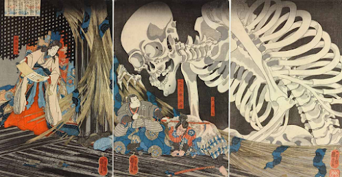
Takayashi the Witch and the Skeleton Spectre, by Utagawa Kuniyoshi (1844)
Design Principle:
Continuation:
The large, curving lines of the skeleton’s body and limbs guide the viewer’s eye through the image. The bony fingers and arms extend toward the characters, leading attention from the upper left to the lower right.
Proximity:
The placement of Takiyasha, the skeleton, and the frightened men creates a strong sense of connection. The witch and the skeleton are positioned closely.
Emphasis:
The massive skeleton dominates the composition, drawing immediate attention due to its scale and detailed rendering.
Asymmetrical Balance:
The composition is weighted more toward the left, where the enormous skeleton looms. This imbalance adds to the dynamic and unsettling nature of the scene.
Movement:
The skeleton’s twisting form, outstretched fingers, and bony limbs create an illusion of it emerging into the scene.
Unity:
The limited yet effective color palette, consistent linework, and detailed patterns unify the composition. The interaction between the figures, along with the balanced use of space, ensures that all elements contribute to a singular, compelling story.
TASK 2: VISUAL ANALYSIS & IDEATION
Full Artwork of Sketch #2
Sketch #2 with Rule of Thirds guide
Sketch 2 Rationale:
This sketch uses Rule of Thirds as composition as an attempt to create the artwork in a different and dynamic angle. The use of destroyed woods between Takiyasha and the skeleton in the artwork was used to align the rule of thirds. Takiyasha once again was in front of the skeleton and the samurai, once again display her hatred and disgust.
TASK 3: DEVELOPMENT & DESIGN
The Final - Takiyasha the Witch and the Skeleton Spectre
Rationale:
The artwork showcases a close proximity between characters, conveying a sense of atrocity and fear. This immerses the viewer in the chaotic and intimidating scene. Every detail in the piece is meticulously arranged to emphasize the brutality of the moment, making the horror of the summon feel more tangible and overwhelming.
A key element enhancing this effect is the use of flowing blood, creating a sense of movement and continuity. The dynamic flow guides the viewer’s eye through the composition, reinforcing the destruction and horror unfolding within the scene. The movement of blood and fire in the background suggests an unstoppable force, further amplifying the sense of chaos and doom.
The simple background captures the visual essence of medieval Japan, grounding the piece in historical context. Additionally, the contrast between the burial ground of skeletons and the fiery tones heightens the visual impact, symbolizing the merging of past suffering with present destruction.
The composition follows the Rule of Thirds, ensuring balance and strategically guiding the viewer’s attention to key focal points. This approach enhances the storytelling by directing focus toward the most critical elements, such as the summoning ritual, the terrified characters, and the overpowering presence of fire and blood.
(200 Words)
REFLECTION:
What have I learnt from this Module?
In this module, I have learned how design principles shape visual composition and impact how viewers perceive artwork. I now understand how continuation guides the eye through a piece, how proximity creates relationships between elements, and how contrast enhances visual interest. I have also explored emphasis, which directs attention to focal points, and asymmetrical balance, which creates dynamic yet harmonious compositions. Additionally, I have learned how movement influences the flow of an artwork and how unity ensures all elements work together cohesively. Overall, this module has deepened my appreciation for how these principles contribute to effective and engaging designs.
What did I enjoy the most?
Ijust loved the creative aspect of applying these principles to my own work and seeing how small adjustments can make a big difference.
What did I not enjoy the most?
Analyzing artworks in great detail could be overwhelming at times, especially when trying to identify multiple principles at once. However, despite these challenges, I recognize that they helped me grow in my understanding of design.
What have I learnt about myself?
I've learnt to appreciate and value my skill as a future designer/artist by working and be more consistent.
What has changed in my learning journey?
I've become much more time managing more than I have used to. What has not changed, however, is my desire to become an aspiring designer, and not giving up.
What are my aspiration?
I aspired to use all the design principles I've learnt to improve my artwork/design and take people's insight as a sign of further improvement.


Comments
Post a Comment