Design Principles - Task 1: Exploration
Khan Saif / 0367438
Design Principles / Bachelor's Design in Creative Media / Taylor's
Task 1: Exploration
Tables of Content:
1. Lecture
2. Instruction
3. Task 1: Exploration
4. Feedback/Reflection
5. Further Reading
LECTURES:
Elements of Design:

Gestalt Theory:
Gestalt being referred to "shape" in German, Gestalt theory explains how humans interpret and structure visual information, emphasizing perception's significance. It focuses on perceptual principles that influence how we organize and make sense of what we see, demonstrating that our minds naturally group elements to form meaningful patterns rather than just processing individual parts separately.

Source: Here
List of Gestalt Theory listed below:
- Proximity
- Similarity
- Continuation
- Closure
- Symmetry
- Figure & Ground
Balance & Emphasis:
Balance is the visual weight in a work of design and it can be symmetrical and asymmetrical.
Types of balances listed below:
- Symmetrical Balance
- Asymmetrical Balance
- Golden Ratio
- Rule of Thirds
Emphasis demonstrates that an element that create dominance and focus in a design work.
Repetition & Movement:
Repetition creates pattern within the work to make the design seem active and create visual excitement.
Movement demonstrates an element that create a composition or a path that the eye follows and can come from any design elements such as lines, shapes and curves.
Others listed below:
- Hierarchy
- Alignment
INSTRUCTION:
1. Describe every design principles listed in lectures.
2. Select art/design images (JPEG, A4, 300dpi).
3. Credit the art/design images.
4. Writeup of 150-200 words why choosing the artwork.
5. Briefly describe the design priciples we've observed.
6. Include feedbacks.
TASK 1: EXPLORATION
Design Principles Exploration:
- Gestalt Theory
Proximity:The visual tendency to group shapes that are laid out close to each other, then be perceived to be belonging to the same group. (Arts & Design Foundation, 2023)


The Raft of Medusa, Theodore Gericault (1818)
The artwork displays a group of people are close enough to form as the same group of object.
Similarity:
Objects when shared visual characteristics are automatically taken to be related (e.g. colors, shapes).


Piet Mondrian, Composition of Red, Blue and Yellow (1930)
These artwork displayed here demonstrates the same shapes grouping together to form a similar visual characteristics.
Continuation:Objects when shared visual characteristics are automatically taken to be related (e.g. colors, shapes).
Piet Mondrian, Composition of Red, Blue and Yellow (1930)
These artwork displayed here demonstrates the same shapes grouping together to form a similar visual characteristics.
Intersections between elements (Lines, curves) which are aligned with each other to set a continuous flow that an eye can naturally follow.

Vincent Van Gogh, The Starry Night (1889)
Vincent Van Gogh's Starry Night had an eye-catching swirling brushstrokes that lead the viewer's eye through the sky.
Closure:
Complex visual arrangement that fits the gap of patterns concretely.

A photograph of a zebra, for example, results in a complete image in our minds by filling the blanks, despite the "missing" body parts, thanks to the zebra's synergy to the white background.


Logos like IBM and NBC use missing gaps to form an image of their identity.
Symmetry:
Elements that are symmetrical to each other to be perceived as a group.

Leonardo Da Vinci, Vitruvian Man (1490)
Figure & Ground:
Visual objects that prominently perceived being either in the foreground or in the background.


- Contrast
Uses elements (colors/shapes) to emphasize the difference between them, which in turn creates dynamism.

Andy Warhol, Mao (1972)
Andy Warhol, Mao (1972)
- Emphasis
Emphasis demonstrates that an element that create dominance and focus in a design work.
- Balance
Symmetrical Balance:
Has equal "weight" on equal sides of a centrally placed fulcrum. The equal arrangement of elements on either side of the central axis and arranging elements equally around a central point results in radial balance.
Asymmetrical Balance:
Unequal visual weight at each side of the composition, which has more dynamic effects, thanks to the dominant element that is balanced by a less focal point on the other side.
Golden Ratio:
Originally a mathematical concept, it also has used for centuries as a guide to create visual guideline in multiple art media such as architecture and painting.
Source: Here (digitalcameraworld.com)
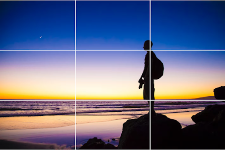
Rule of Thirds:
A composition guideline to create more dynamism to a work on design/photography/film etc. Dividing an image evenly into thirds with the subject of the image is placed at the intersection of those dividing lines, which create a huge emphasis on that subject.
- Repetition
- Movement
Movement demonstrates an element that create a composition or a path that the eye follows and can come from any design elements such as lines, shapes and curves.
- Harmony & Unity
- Symbol
Artworks have been chosen:
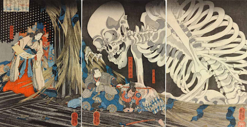
Takayashi the Witch and the Skeleton Spectre, by Utagawa Kuniyoshi (1844)
Writeup:
Continuation:
The large, curving lines of the skeleton’s body and limbs guide the viewer’s eye through the image. The bony fingers and arms extend toward the characters, leading attention from the upper left to the lower right.
Proximity:
The placement of Takiyasha, the skeleton, and the frightened men creates a strong sense of connection. The witch and the skeleton are positioned closely.
Emphasis:
The massive skeleton dominates the composition, drawing immediate attention due to its scale and detailed rendering.
Asymmetrical Balance:
The composition is weighted more toward the left, where the enormous skeleton looms. This imbalance adds to the dynamic and unsettling nature of the scene.
Movement:
The skeleton’s twisting form, outstretched fingers, and bony limbs create an illusion of it emerging into the scene.
Unity:
The limited yet effective color palette, consistent linework, and detailed patterns unify the composition. The interaction between the figures, along with the balanced use of space, ensures that all elements contribute to a singular, compelling story.
FEEDBACK:
WEEK 3:
1. Complete feedback/Reflection session in the E-portfolio.
2. The design principles of the artwork selected needs to be expand upon.
3, Include Jump Links
WEEK 2:
1. The website needs to look more organized and presentable.
2. Lecture needs to have the visual examples for each design principle.
3. Need to include more for the task assignment. (Design Pricinples Description, Writeup etc.


Comments
Post a Comment