Task 3A & 3B Innovative Packaging & Merchandising
2024.10.23 - 2024.12.23 (Week 6 - Week 14)
Khan Saif / 0367438
Packaging and Merchandising Design / Bachelor's Design in Creative Media / Taylor's
Task 3: Innovative packaging & Merchandising
Instruction:
Process:
BRAND INTRODUCTION:
MOODBOARD:
On the top left of the moodboard, is a illustration of osmanthus flower it would be a great reference for us on how we want to illustrate the flower. The bottom left are reference for our label design to place the logo in the center. The center image is a layout reference. On the right are the color and layout aesthetic we wanted to go for our packaging design. After the reference we split our task with Khan focusing on the illustration, me and renot on the layout of the design. (CREDIT: KAN REN WEI)
Submission:
Presentation:
Mockup Displays:
Mockup 1. Ice Cream Cart
Mockup 2. Apron
Mockup 3. Billboard
Mockup 4. Ice Cream
Mockup 5.1. Shopfront 1
Mockup 5.2. Shopfront 2
Mockup 6. Ice Cream Cooler
Mockup 7. Cap
Mockup 8. Ice Cream Package
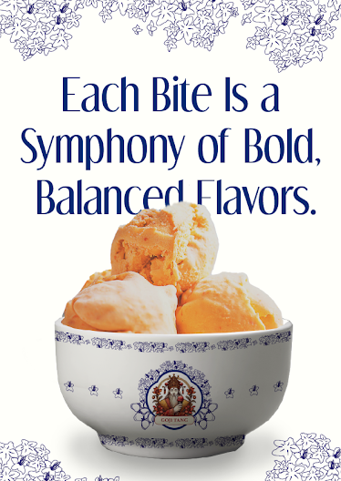
Mockup 9. Bowl
Mockup 10. Coffee Cup
Mockup 11.1. T-Shirt Front
Mockup 11.2. T-Shirt Back
Mockup 12. Tote Bag
Brand Introduction:
Osmanthus Goji Gelato that contained traditional ingredients such as herbs with rich antioxidant and good source of dietary fiber and tea contain many variety of flavornoids, and known for its anti-inflammable and anti-cancer properties.
Fonts:
Dream Orphans & Roboto
Color Palette:
Dark Blue & White
Inspired by Chinese blue and white porcelain, the packaging reflects tradition, cultural pride, and artisanal craftsmanship, linking the ice cream to timeless Chinese artistry. The two-tone palette of dark blue and pale white creates a clean, striking contrast, appealing to modern consumers with a preference for elegance and premium simplicity.
Design Concept:
A blend of symmetry and minimalism, with bold colors highlighting key ingredients like goji berries and osmanthus. The typography and clean space add a premium, global appeal.
The packaging bridges tradition and innovation, using ornate patterns, and subtle textures to narrate the product's link to Chinese culture and luxurious indulgence.
Feedback:
Week 10: Need to make a 3D printout of our product to showcase through our upcoming presentation.
Week 11: Need to complete merchandising mockups right after the presentation.
Reflection:
Throughout the task, there's a lot of profound learning experience that combined creative thinking, strategic planning, and practical application to the marketing principles and teamwork. One of the most rewarding aspects of this assignment was the creative process. The colors, typography, and material choice must align with the brand’s values and resonate with the target audience. This task reinforced the importance of cohesive branding and how minor details can create lasting impressions.
Reflecting on this assignment, I recognize how much my perspective on packaging and merchandising has evolved. Initially, I viewed packaging as a secondary aspect of product marketing. However, I now appreciate its role as the first point of interaction with the consumer, making it a critical factor in influencing purchase decisions.


.png)
Comments
Post a Comment