Advance Typography - FINAL COMPILATION
(Week 1 - Week 14) [Deadline: Week 14]
Khan Saif / 0367438
Advanced Typography / Bachelor of Design (Honours) in Creative Media / Taylor's University
Final Compilation
Final Submission:
E-Portfolio: https://0367438khansaif.blogspot.com/2024/04/advance-typography-task-1-exercise.html
Task 1, EX.1: Typographic Systems
8 Typographic system (Without Guides)
8 Typographic system (With Guides)
Task 1, EX.2: Type & Play
Task 2: Key Artwork
E-Portfolio: https://0367438khansaif.blogspot.com/2024/06/blog-post.html
Submission:
Final (Black word on White BG) | 1024px, 300pi
Final (White word on Black BG) | 1024px, 300pi
Final Color Palette | 1024px, 300pi
Final (Dark Word with Light BG) | 1024px, 300pi
Final (Light word on Dark BG) | 1024px, 300pi
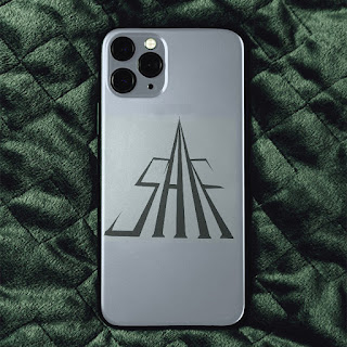
Logo 1
Final Collateral 1 | 1024px, 300pi
Final Collateral 2 | 1024px, 300pi
Final Collateral 3 | 1024px, 300pi
Screenshot of Instagram
Instagram Link: https://www.instagram.com/saif_adv_typo/
Task 3: Type Exploration & Application
FONT PRESENTATION (5 ARTWORKS)[1024 px, 300ppi]
FONT APPLICATION (5 ARTWORKS)[1024 px, 300ppi]
Experience
Overall, I find Advanced Typography to be a transformative journey. As this is the conclusion of my reflection, I want to reflect upon my 3 tasks from Advance Typography, as I think each contribute to my understanding and application in a unique throughout this course:
Task 1 introduced the basics but also the sophisticated parts of typographic systems. The basic typographic system taught me the idea of visual organization and exploring visual perspective with horizontal and vertical grid system. The sophisticated part of the typographic systems is to dissect and identify letterforms with images and refine them with expressive communication.
Task 2 focused on creating key artwork that embodies our identity. As the task has different scenarios of deep self-reflection, it is also a creative exploration of one's identity. This not only challenges me to use my identity to bring it into life, but also teaching me the importance of consistency in branding.
Task 3 was a culmination of I've learned and gained throughout the semester.
Observation
I'll admit, trying to create a typeface that seems purposeful to certain a genre of design can be stressful, because there is so much I need to pay attention of when doing this project. Strokes, weights, kerning, lettering, these fundamentals, no matter how precise we're trying, there's always that one slight adjustment of letter, numeral, punctuation or symbol can are either getting too close or too far from each other, can cause a lot of distracting details, thoughts and feels between THE aesthetic and cognitive characters of the typeface that I have to repeat the cycle of trial and error and perfectionism. Overall, there is so much attention and proportion I have to pay for this project, and I understand that how important the consistent values for typefaces are.
Findings
This course reveal to have many strategic takes on creative typography blended with technical skill and creativity. Each task has a solid foundation of both visual appeal and representation


.jpg)


.png)
Comments
Post a Comment