Advanced Typography - Task 2: Key Artwork
(Week 5 - Week 8) [Deadline: Week 8]
Khan Saif / 0367438
Advanced Typography / Bachelor of Design (Honours) in Creative Media / Taylor's University
Task 2: Key Artwork & Collateral
Instruction:
fig 1.1 | Module Information Booklet
Task 2A: Key Artwork
Sketch/Concept:
There were numerous concept and experiments to be drawn here:
fig 1.2 | Concept Sketch #1
fig 1.3 | Concept Sketch #2
They both share the same idea of fantasy theme font. Not just for my love of fantasy themes of media, but the word "fantasy" is the synonym of imagination and creation, and I want to create on that brand based on what designers want to be and should be.
However, I find the font I've designed relatively unappealing, and back to the drawing board. I want to design my typography with the resemblance of shapes. Out of all of the geometric shapes, I find triangle to be the most appealing, as it represents power and purpose. What's more interesting is that triangle, despite being a simple 3-sided shape, gives us the feeling of ascension, which also gives my name a sense of growth and exhilaration.
fig 1.4 | Concept Sketch #3
Despite a promising idea, the sketch so far I had doesn't really match my ideal design, and the way the font shaped makes it too difficult to form a shape together consistently. So I tried to draw the triangle with 5 straight lines and the letters of my name happened to match the shape of the triangle.
fig 1.5 | Concept Sketch #4
Color-wise, it can deeply affect how people perceive with things around us. I chose mainly teal and sky blue color to mainly match two of my identity based on the color psychology. Sky blue mainly symbolizes trustworthiness and professionalism, while the lighter color represents a bit of purity and modern feel, whereas teal color was chosen because it's basically blue and green combined, which symbolizes not only trust, but also growth, something that the triangular approach of my name also represents.
To sum the whole thing up, the font will be designed to give a sharp yet fantasy feel and to give an impression of imagination. Font also shapes like a triangle to enhance the growth and advance, with the sky blue and teal combined represents trust and growth.
Submission:
fig 1. | Final (Black word on White BG) | 1024px, 300pi
fig 1. | Final (White word on Black BG) | 1024px, 300pi
fig 1. | Final Color Palette | 1024px, 300pi
fig 1. | Final (Dark Word with Light BG) | 1024px, 300pi
fig 1. | Final (Light word on Dark BG) | 1024px, 300pi
Task 2B: Collaterals for Key Artwork:
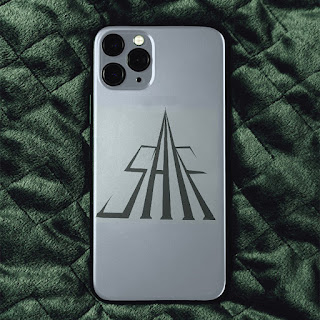
Continuing to Task 2A, we were instructed to make a collateral layout on Instagram for our key artwork. All of these collaterals were attached on photos on Mockey.AI, where we can attach our key artworks to the photo s of merchandise such as T-shirt, bags, hats, and phone cases etc. with ease.
As I previously mentioned, the key artwork was based on the shape of the triangle. This logo is the same as the key artwork, except removing some strokes of the letter such as "S" and "F" to match the shape. Patterns wise, I have merged the logo I mentioned and once again, merge into the triangle altogether, with logos and the background color followed the color palette I have chosen for this key artwork.
For the collateral, I chose the handbag, cap and phone case. This was chosen based on the effectiveness of the photo and the color choice. For most collaterals, I accessed photoshop to recolor the background in order to match the color palette for this key artwork.
fig 2.1.1 | Logo 1
fig 2.2 | Final Collateral 1 | 1024px, 300pi
fig 2.3 | Final Collateral 2 | 1024px, 300pi
fig 2.4 | Final Collateral 3 | 1024px, 300pi
fig 2.4| Screenshot of Instagram
Instagram Link: https://www.instagram.com/saif_adv_typo/
Feedback:
Week 5 (20/5/2024):
1. Create an artboard size of 210mm x 297 mm based on the artwork of the name.
2. Negative Space for the artwork should make the design look appealing.
Week 6 (27/5/2024):
Choose 4 color palette for my key artwork to begin my pentagram site, and make animation after that.
Reflection:
Experience:
After 5 weeks of exhilarating typographic endurance, I entered a period where I can actually expand my design skills and thinking while using my imagination and creativity to make something worthwhile. It's quite an trial and error task, but better than staying at comfort zone.
Observation:
As the lecturer said, we all had to differentiate our personality and our clients' expectations at the same time during our research and ideation process. Yes, everyone needs to expand their horizons and creativity, but we also must be mindful and look around what's been our target audience been up to lately. Maybe I'm imagining things, but I love how this task develop the subtlety of balance between our ideals and realism. Now that I've done my task, I no longer keeping the fear of wagering the clients' expectations and not being able to enjoy my work using my creativity.
Findings:
Like I said, despite the observation of realism and ideals, this is the most trial and error I've done so far. Yes, ideas are free, but with sloppy execution, and it takes even weeks to perfect my typography. That being said, the task was a great opportunity to expand my horizons while understanding the reality of everyone's mind.
Further Reading:

.jpg)


.jpg)


.png)
Comments
Post a Comment