Typography 1: Development / Timeline
Last Update: October 3rd, 2023 (Week 2)
1. Early Letterform Development:
Letters were originally written, or preferably, scratching into wet clay with sharpened sticks or carving into stone
with a chisel. Originally, the uppercase letterform is the combination of straight lines and circles.
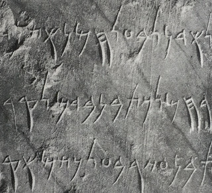
Fig 1.1 4th century B.C.E. Phoenicians votive stele Carthage
Fig 1.2 Before/During the Greek letterform period
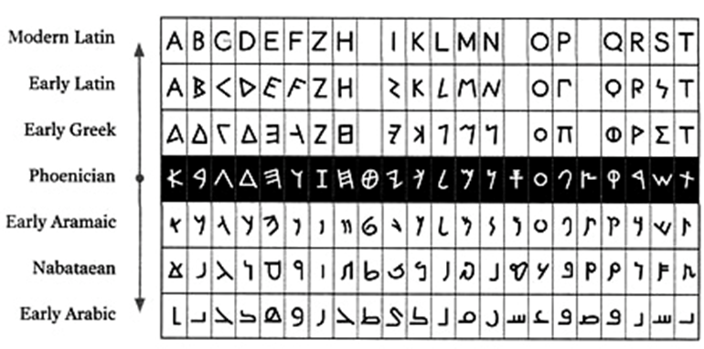
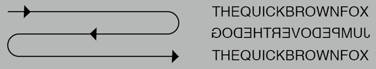
The Greek changed the direction of writing from left to right, as opposed of Semitic people and Phoenician writing from right to left.
This style of writing is also known as “boustrophedon”.
The more direction of reading/writing they changed, the more the orientation of letterforms changed as well.
Fig 1.3 Boustrophedon
Etruscan carved the letterform that shows the qualities of the strokes at the tip of every letters, and change the weight from vertical to horizontal.
Fig 1.4 (Left to right) Phoenician (1000 B.C.E.), Greek (900 B.C.E.), Roman (100 B.C.E.)
2. Hand Script from 3rd to 10th Century:
Square Capital:
Fig 1.5 4th-5th Century: Square Capital
Rustic Capital:
They are more compressed and slightly hard to read compared to square capital.
Allow for twice as many words on a sheet of parchment and took less time to write.
Strokes can be achieved by holding at an angle of 30 off the perpendicular.
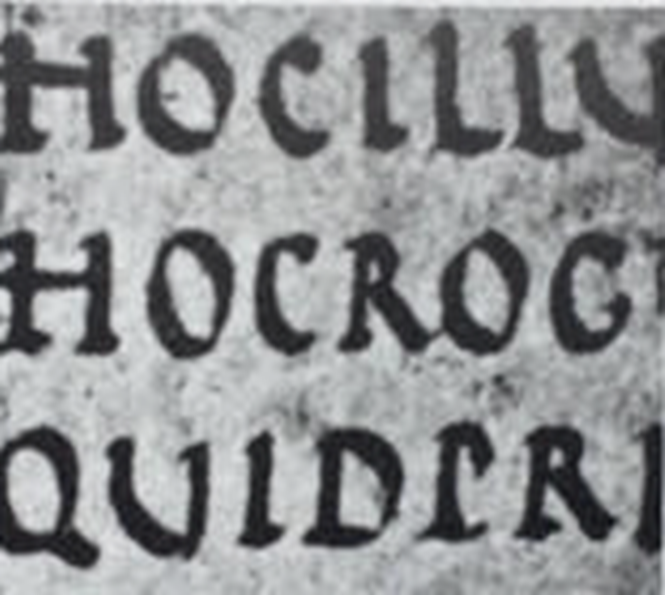
Fig 1.6 Late 3rd - mid 4th century: Rustic Capitals
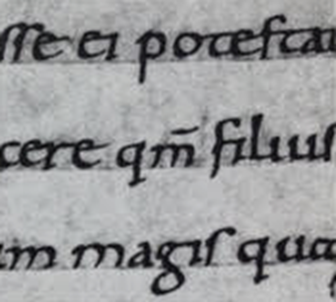
Roman Cursive:
Fig 1.7 4th century: Roman Cursive
Uncials:
Incorporate some aspects of Roman Cursive (especially letters like A, D, E, H, M, U and Q).
Originated from “Uncia”, a Latin word that described the twelfth of anything.
They combine the shape of uppercase letters and the size of lowercase letters to form “small letters”.
The broad forms of uncials are more readable at small size than rustic capitals.
Fig 1.8 4th - 5th century: Uncials
Half-Uncials:
Fig 1.9 C 500: Half-Uncials
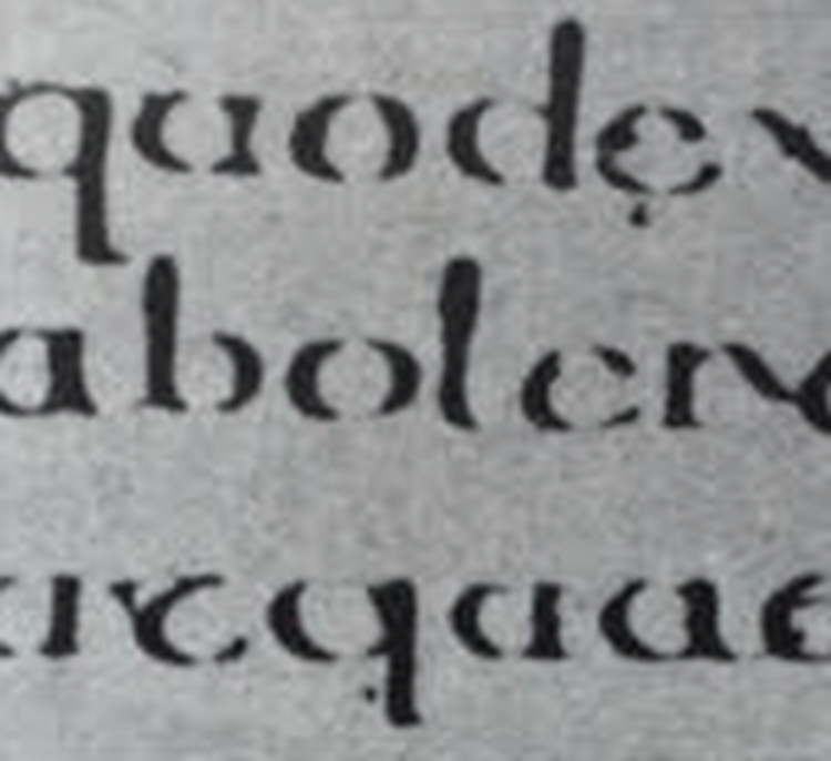
Chalremagne (Caroline Minuscule) :
Chalremagne was the 1st unifier of Europe since Roman times.
The Monks from York and St.Martin of Tours rewrote the texts using uppercase, miniscule, capitalization and punctuation which set the standards of calligraphy for a century.
Fig 1.10 C 925: Caroline Minuscule
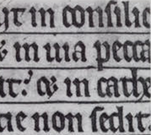
In northern Europe, a condensed strongly vertical letterform known as Textura gained popularity.
In southern Europe, a rounder letterform known as Rotunda, more open hand, gained popularity.
The humanistic script is based on Alchin of York’s miniscule.
Fig 1.11 C 925: Caroline Minuscule
3. Blackletter to Gutenberg's type:
In northern Europe, a condensed strongly vertical letterform known as Textura gained popularity.
In southern Europe, a rounder letterform known as Rotunda, more open hand, gained popularity.
The humanistic script is based on Alchin of York’s miniscule.
Fig 1.12 C 1300: Textura
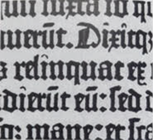
Fig 1.13 C 1455: Rotunda
4. Text Type Classification:
1450 Blackletter:
The earliest printing type, its forms based on the hand-copying styles that were used in Northern Europe.
Examples: Cloister Black, Goudy Text
1475 Oldstyle:
Based on the lowercase letterforms of Italian humanist scholar and uppercase letterforms found on Roman ruins, the forms evolved away from the calligraphic origins for over 200 years and migrated across Europe.
Examples: Bembo, Caslon, Garamond, Janson
1500 Italic:
Echoing Italian handwriting, virtually all typefaces (including Roman) have been designed with Italic forms since the 16th century.
Originally replicated engraved calligraphic forms, Script ranged from the formal and traditional to the casual and contemporary.
Examples: Kunstler Script, Mistral, Snell Roundhand
A refinement of old style forms, this Transitional style achieved because of advanced casting and printing, with
Examples: Baskerville, Bulmer, , Century, Time Roman
Represents a further rationalization of oldstyle letterforms, Serifs were unbracketed, and the contrast between thick and thin strokes extreme.
1825 Square Serif / Slab Serif:
With little variation between thick and thin strokes, these faces responded to the newly developed needs of advertising for hreavy type in commercial printing.
1900: Serif / Sans Serif:
Though forms were introduced all the way back in 1816 by William Caslon IV, it did not become the widespread until in the 20th century.
Variation tended to evolve towards either humanist forms (Futura) or Geometric (Gill Sans). Occasionally, strokes were flared to suggest the calligraphic origins of the forms (Optima). Sans Serif also reffered as Grotesque and Gothic.
Typography 3: Text Part 1
Last Update: October 10th, 2023 (Week 3)
1. Kerning and Letterspacing:
- Kerning: It's the term refers to the automatic adjustment of space between letters.
- Tracking: Removal of a space in a word or sentence.
Fig 3.1 Difference between kerning and no kerning
Fig 3.2 Normal Tracking, Tight Tracking, Loose Tracking with Univers 55 typeface
Fig 3.3 & 3.4 Difference between Normal Tracking (left), Loose Tracking (right) and Tight Tracking (Center)
2. Formatting Text:
Flush Left: This format starts at the same point for each line, but ends wherever the last word on the line ends.
Fig 3.5 Left-Flushed Text
Centered: The format imposes symmetry, assigning equal value and weight to both ends of any line. It transforms the fiend of text to a picturesque quality that is non-pictorial by nature.
Flush Right: Places emphasis on the end of the line as opposed to its right. Could be useful when relationship between text and image is ambiguous without a strong orientation to the right.
Fig 3.7 Right-flushed Text
Justified: Like centered, this format imposes symmetrical shape on the text. It is achieved by expanding or reducing spaces between words and sometimes, between letters.
Fig 3.8 Justified Text
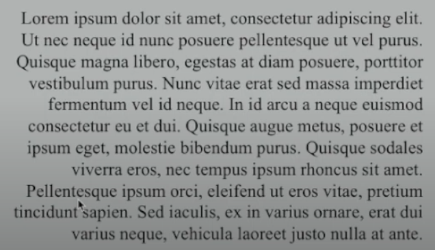
3. Texture
Type with a generous x-height or heavy stroke to product darker masses to create successful layout with differences in color.
Fig 3.9 Introduction of Texture
4. Leading Line Length
Tips that will set text type to a easy, prolonged readings:
- Text Size: Text type should be large enough to read easily at arm's length.
- Leading: Text that set too tightly encourages vertical eye movement, otherwise the readers will loose their place.
- Line Length: Appropriate leading for text is as much a function of the line length as type size and leading. Shorter lines require less leading, while longer lines require more. Keep the length between 55-65 characters.
5. Type Specimen Book:
A type specimen book shows sample of typefaces in various different sizes. The goal of the book is to provide an accurate reference for type, type size and type line length.
Fig 3.10 Sample of Specimen Sheet
Compositional Requirement:
- Text should create a field that can occupy a page or a screen, like having a middle gray value, not a series of stripes.
Fig 3.11 Sample of compositional requirement (Left article has middle gray value, While Right article has series of stripes)
- Keep the sample of specimen enlarge (to 400% of the screen) to get a clear sense of relationship between ascenders and descenders.
Fig 3.12 Sample of enlarged specimen to keep ascenders and descenders in check
Typography 4: Text Part 2
Last Update: October 17th, 2023 (Week 4)
1. Indicating Paragraph
Pilcrow: A holdover from medieval manuscripts seldom use today. Both line space and paragraph space should be in 12 pt. This ensures cross-alignment across column of text.
Examples below here displays the standard indentation. The indent is the same size of line spacing or the same as the point of the text.
The method of extended paragraph below creates unusual wide column of text and they can be strong compositional or functional method to do so.
Fig 4.1 & 4.2 Samples of Pilcrow
Fig 4.3 Samples of line space vs leading
2. Widows and Orphans
A widow is a short line of type left alone at the end of the column of text.
An orphan is a short line of type left alone at the start of a new column.
Typography 2: Basics
Last Update: October 24th, 2023 (Week 5)
1. Describing Letterforms:
Baseline: The visual base of the letterforms.
Median: Defining the X-Height of letterforms.
X-Height: The height in any typeface of the lowercase 'x'.
Fig 2.1 Baseline / Median / X-Height
Strokes: Any line that define the letterforms.
Fig 2.2 Strokes of 'A' , 'B' , 'C'
Apex/Vertex: The point created by joining 2 diagonal stems (apex above and vertex below)
Fig 2.3 The Apex of 'A' , and the Vertex of 'M' and 'V'
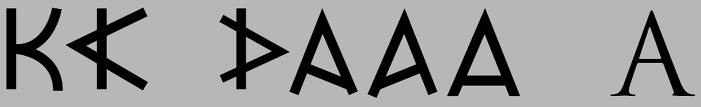
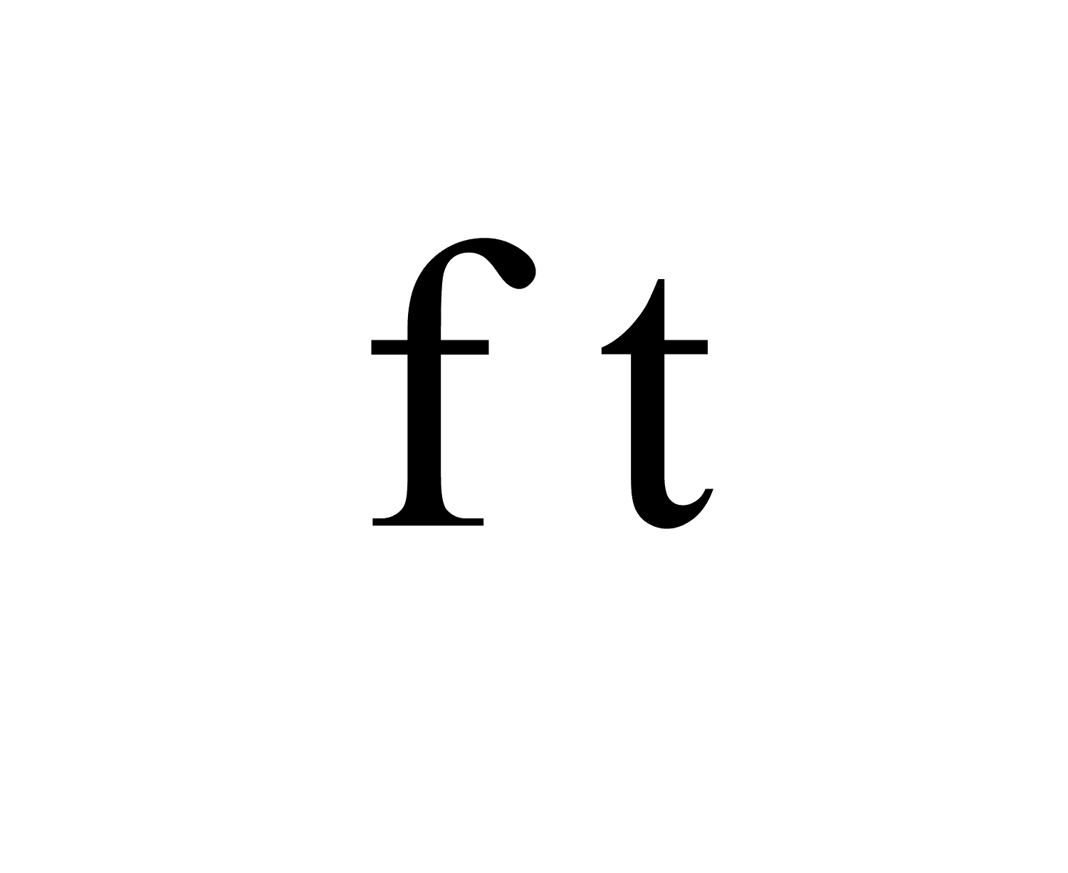
Arm: Strokes off the stem of the letterform, either horizontal (E, F, L) or inclined upward (K, Y).
Fig 2.4 Horizontal arm of 'F' and ' T ', and upward arm of 'Y'
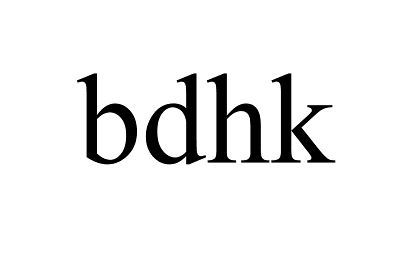
Ascender: The portrait of the stem of a lowercase letterform that projects around the median.
Fig 2.5 Ascender of lowercase 'b' , 'd', 'h', 'k'
Bracket: The transition between the serif and the stem.
Fig 2.6 Bracket of uppercase 'T' and lowercase 'l'
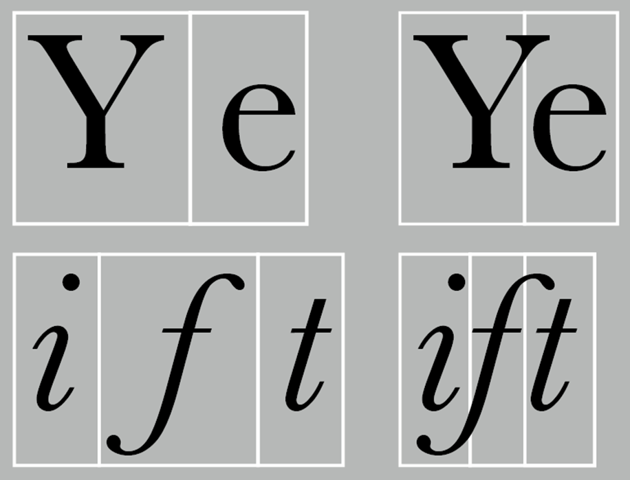
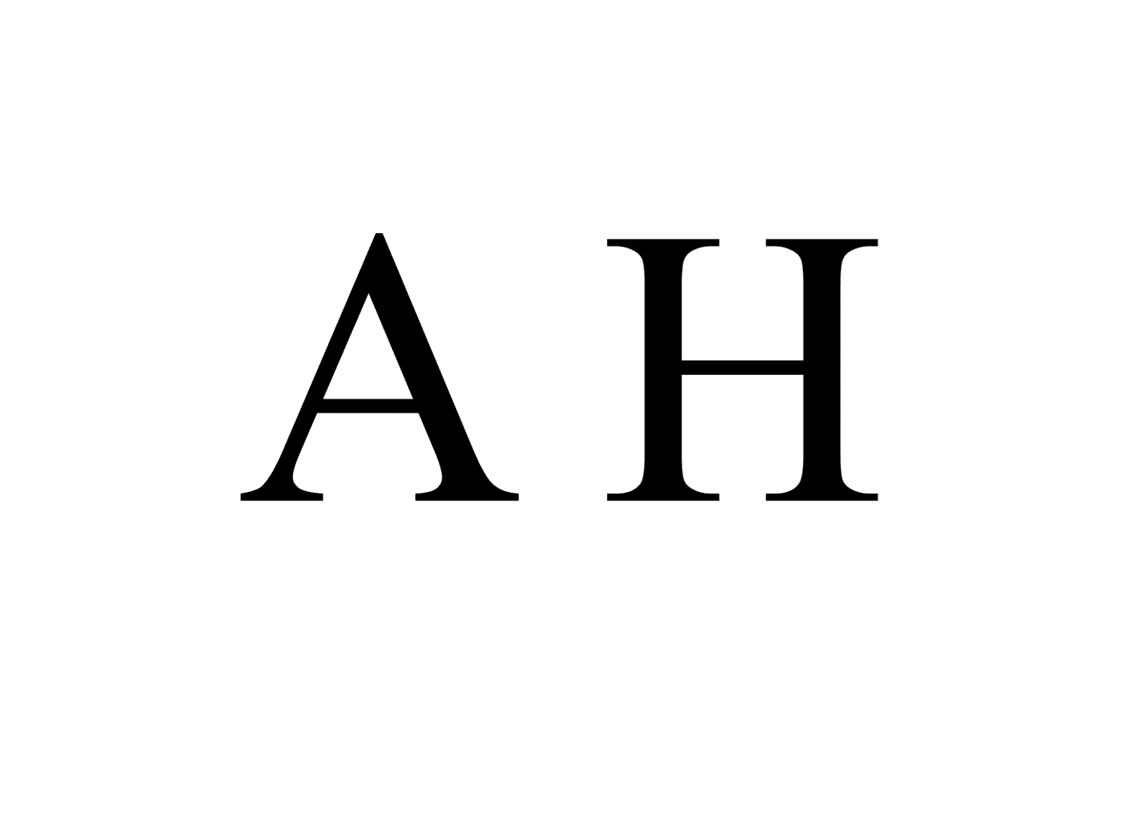
Cross Bar/Cross Stroke: The horizontal stroke in a letterform that joins 2 stems together.
Fig 2.7 Cross bar between the stem of 'A' and 'H'
Fig 2.8 Cross Stroke between the stem of 'f' and 't'
Crotch: The interior space where 2 strokes meet.
Fig 2.8 2 uppercase letters 'K' and 'V' leaves crotch for space
Descender: The portion of lowercase letters that projects below the baseline
Fig 2.9 Lowercase letters like 'p', 'q', 'y' have stems below the baseline
Ear: The stroke extended out from the main stem or body of the letterforms.
Fig 2.10 Letters like 'g', 'r' have strokes extended out of the letterforms.
Finial: The rounded non-serif terminal to a stroke.
Fig 2.11 Letters like 'f' and 'a' have rounded terminal to a stroke
Leg: Short stroke off the stem of the letterform. Either at the bottom of the stroke or inclined downward
Fig 2.12 Letter 'L' have a leg at the bottom of stroke, while letter 'K' and 'R' inclined downward
Ligature: The character formed by the combination of 2 or more characters.
Link: The stroke that connects the bowl and the loop of lowercase 'g' .
Loop: In some typefaces, the bowl created in the descender of the lowercase 'g'.
Fig 2.14 Lowercase 'g' has a stroke and the bowl at the descender
Serif: The right-angled foot or oblique foot at the end of the stroke.
Fig 2.15 Uppercase Letter 'A', 'T' and 'M' have 2, 1 and 4 feet respectively
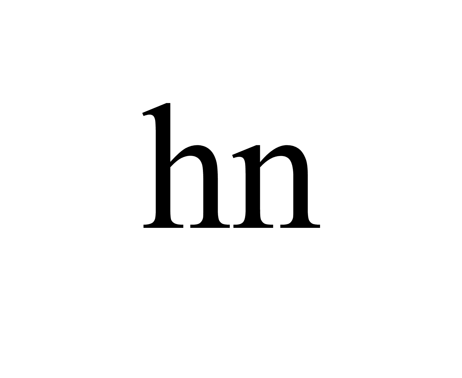
Shoulder: The curved stroke.
Fig 2.16 Lowercase letter 'h' and 'n' have curved stroke.
Spine: The curved stem of uppercase and lowercase 'S' / 's'.
Fig 2.17 Cursed stem of S
Stem: The significant vertical or oblique stroke.
Fig 2.18 The Vertical stroke of uppercase 'T', lowercase 'b' and 'p' and the oblique stroke of 'V'
Stress: The orientation of the letterform, indicated by the thin stroke in round forms.
Fig 2.19 The thin stroke in round form of 'O' and 'e'
Swash: The flourish that extends the stroke of the letterform.
Fig 2.20 The stroke extension of 'A' , 'T' and 'W'
Tail: The curved diagonal stroke at the finish of certain letterforms.
Fig 2.21 The curved tail stroke of uppercase 'Q'
Terminal: The self-contained finish of a stroke without a serif for some typefaces.
Fig 2.22 Some typefaces of 'T' and 't' has a stroke without a serif.
2. The Fonts:
Small Capitals: Uppercase letters that draw to the x-height of the typeface.
Fig 2.23 Comparison of small capital uppercase forms
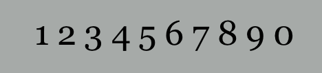
Uppercase Numerals: Same height as uppercase letters that all set to the same kerning height.
Fig 2.24 Uppercase Numerals
Lowercase Numerals: Similar to lowercase letters, they all set to x-height with ascenders and descenders,
Fig 2.25 Uppercase Numerals
Italic Letters: Small Letters always Roman typefaces. The formal Italic refer back to the 15th century Italian cursive handwriting. Oblique are typically based on the Roman form of the typeface.
Fig 2.26 Uppercase Small and Lowercase Letters
Fig 2.27 Difference between Roman and Italic Letters
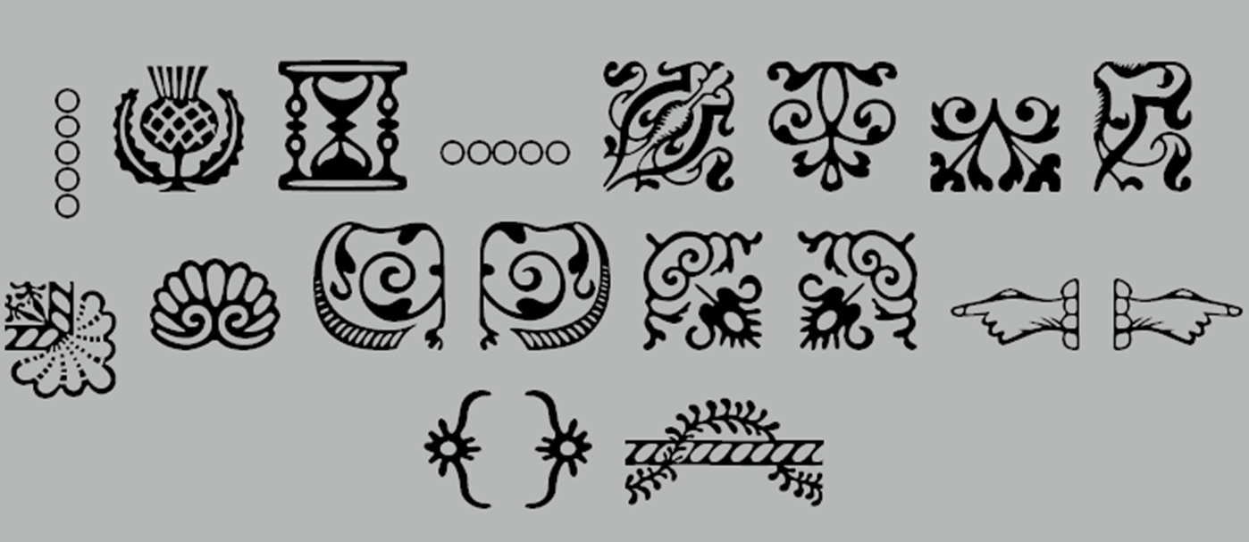
Punctuation, miscellaneous characters: Miscellaneous characters can change from typeface to typeface that must be acquainted with all of the characters before set the appropriate type.
Fig 2.28 All the punctuation and miscellaneous characters
Ornaments: Used as flourishes in certificates and invitations. They usually provided as a font in a larger typeface family. Only a few classical and traditional typefaces contain ornamental fonts (Adobe Caslon Pro).
3. Describing Typefaces:
Roman: Uppercase forms are derived from inscription of Roman monument. A slightly lighter stroke in Roman is known as Book.
Italic: Named for Italian handwriting during 15th century.
Oblique: Conversely are based on Roman form of typeface.
Boldface: Characterized by the thicker stroke than a Roman form. It can also be called 'semibold' , 'medium' , 'black' , 'extra bold', or super.
Light: A lighter stroke than the Roman form. Even the lighter strokes are called 'thin'.
Condense: A version of Roman form, and extreme condense styles are often called 'compressed'.
Extended: An extended variation of Roman fort.
Fig 2.30 All the typefaces described above (Roman, Italic, Boldface, Light, Condense, Extended
Typography 5: Understanding
Last Update: October 31st, 2023 (Week 6)
1. Understanding Letterforms:
The uppercase letterforms below supposed to suggest symmetry, but not symmetrical at the same time.
Fig 5.1 This Baskerville letter 'A' has 2 different stoke weight
Both Baskerville and Univers typeface demonstrate the care of creating letterforms that are both harmonious and expressive.
Fig 5.2 This Univers letter 'A' shows the width of ledt stroke thinner than the right.
Below, it's a comparison of Helvetica and Univers lowercase letter 'a'. Both are seemingly similar sans-serif typefaces and yet show the comparison of how the stem of the letterform finish and the bowls meet the stem quickly, which quickly reveals the palpable difference in character between the two.
Fig 5.3 Comparisons of Helvetica and Univers typeface of letter 'a'
Fig 5.4 Both typefaces merge together for closer look of differences
While x-height describes the space and size of lowercase letters. However, curved strokes letters like 's' must rise above the median of x-height in order to appear the same size as the vertical and horizontal strokes as they rejoin.
2.
Fig 5.5 Both typefaces merge together for closer look of differences
Task:
Type Expression:
In this task, I was given 4 out of 6 words for choices to express through research for inspiration and sketch for expression with a pencil.
Words of choice: "Chaos", "Bounce", "Dive", "Crush"
Chaos:
Chaos is a matter of confusion and complexity. It is described as a mess, whether it's a psychological, emotional level. With that being said, typography can be a chaotic mess as well. Designers have tried many, many experimental concepts based on the logo for a product or event.
For me, "chaos" can be so many things, both in life and fiction. Comparing having problems following the math equations like algebra and geometry, to a formless deity or creature took over the planet are 2 different things altogether, but they all share emotions of confusion, distress etc.
Sketch:
1. A simplistic typography that resembles Gorgon, while the word echoes through the shadow.
2. A brain that subtly showing the word, chaos, which resembles psychological disorder and distress.
3. It's more like a Halloween themed logo. Both letter "A"s are ghosts that display anger and fear, while the small-cap of the word echoes through the shadows.
4. An abstract form of the word "chaos".
Research:
Bounce:
What makes an object bounce? Trampoline? Rubber bands? They could work. But in the world of typographic art, anything is possible. Try to bounce something with a carpet or ribbon.
On top of just making everything bounce, saying the word aloud describe the fun, the excitement of something we all would describe fun, most directly towards children.
Sketch:
1. Bounce with carpet between the upper part and lower part of the letter.
2. Bounce with ribbon as the further the letter, the bouncier.
3. The "O" is a birthday present ribbon posing a bouncing line.
4. The "O" is a chemical glass, with the liquid on top posing a bouncing line.
Dive:
I'm no expert of diving positions, not much of an expert that an alphabet letter would have a better performance. Picture how many potential movement the letters like "V" and especially "i" can perform compare to even the most professional divers.
Typography is also a form of movement. Other words like "run", "swim", "punch" or "yoga" are also a good candidate for movement typography, but dive is rare form of sports and an interesting study of kinesiology, which is why I am excited to cover this one, regardless of the result of execution.
Sketch:
The "i" is the iconic pose for "dive", but different letters also perform different diving position. The logo also descent from "D" to "E", resembling the gravity of diving.
Crush:
Crush is a simple word. We break an object into pieces, that defines crush. Doesn't sound too intense, right? But when it comes to crush something, how far can we go, or rather how far can an earthquake go?
Earthquake can break, or rather shake something as heavy as a building, crumbles the ground to pieces, and then call it a day, right?
However, earthquake can't crush something. They shake and crumble things, So I'll just leave the crumbles on the logo while the word "crush" is barely stand altogether. Pretend me smashing the table with the word "crush" on it.
Sketch:
Feedback:
Week 3:
Final Submission for Task 1, Ex 1:
Week 4:
Final submission for Task 1,Ex 1 (Animation):
Week 5:
Final Submission for Task 1, Ex 2
With Grid:
Without Grid:
Details for Task 1 Ex.2:
HEAD:
Fonts: Bodoni MT (Regular) "I am", Univers LT Std (Bold) "Helvetica",
Gill Sans Std (Italic) "By John Doe"
Type Size: 72 pts (Bodoni MT), 60 pts (Univers LT Std), 20 pts (Gill Sans)
Leading: 86.4 pts (Bodoni MT), 72 pts (Univers LT Std), 24 pts (Gill Sans)
Paragraph Spacing: 0mm
BODY:
Fonts: Adobe Caslon Pro (Regular)
Type Size: 10.8 pts (36pt for the letter H)
Leading: 13 pts
Paragraph Spacing: 0mm
Characters per-line: 45-60
Alignment: 0mm
Margins: 12.7mm (top, left, right), 50mm (bottom)
Columns: 4
Gutter: 0mm
Feedback:
Week 2:
Specific Feedback:
The concept art design for the 4 words is visually distinctive. However, it is overdesigned and execution for the design in illustrator can be difficult.
General Feedback:
The blogger website's layout is also a bit messy.
Week 3:
Specific Feedback:
I've presented my 4 typography expression. While words like "CRUSH" and "DiVE" have more impactful expression, they include too much edit and effect, which is something that project tends to avoid.
General Feedback:
The website should include lecture's note every week.
Week 4:
Specific Feedback:
I've presented my animation for DiVE. However, the animation is a bit choppy and does not have a sense of diving while the word is animating. So I cut a few frames to make the animation a bit smoother.
General Feedback:
The website should include lecture's note every week.
Week 5:
Specific Feedback:
While the layout of and text design is fine, the paragraph's overlay and need to redo the paragraph.
Reflection:
Typography is somewhat a new experience to me. It tends to focus less on self-expression, but rather a different knowledge of reading altogether in my opinion. In this project, I've learnt Typography's expression is quite subtle, like the concept of different fonts and typefaces have different purpose for readers to understand the expression. and communication. Because texts, letters and words are essential for our daily communication our lives, I understand there are more to typography than meets the eye.
What I need to improve is 1 major thing outside of that would be time management. As designers, there needs to be a consistent work ethic, and I know, as a matter of fact, I need to improve on that for the next project.
That aside, I do enjoy my work, despite my flaws, both on ethical and creative side of things. I enjoy communicating my design and it is rewarding to come up with new ideas while understanding the origin and advancements of typography, which makes me hopeful that I'm capable communication with typography even more.


Comments
Post a Comment